Let’s be real for a second. In a world jam-packed with noise, constant scrolling and endless notifications, there’s one thing that cuts through all that chaos without saying a single word – color. That’s right, my friends, color. Color is a visual language that evokes emotion, carries meaning and can drive a plot in ways more powerful than dialogue. It doesn’t shout, it doesn’t interrupt – hell, it doesn’t even try to grab your attention… but when used right, it DEMANDS you notice – and suddenly, you’re hooked. And filmmakers? Oh, they know how to use it like a flirtatious wink or a whispered secret, crafting whole damn stories with it. From warm yellows to cold blues and desaturated tones to stark gradients, color is a key storytelling tool that leaves clues and connects characters.
So, let’s dive in, shall we? We’re talking about color as a storytelling tool that goes way beyond just looking pretty. It feels, it tells, and it connects in ways words sometimes can’t.
The Power of Color in Film: Case Study of “The Sixth Sense” (Spoiler Alert!!)
First, let’s talk about The Sixth Sense. Oh honey… if you haven’t seen it, what are you even doing with your life? Go watch it, then come back… because we’re about to drop some truth bombs!
One of the things that makes Shyamalan’s psychological thriller so freakin’ brilliant is how he uses color—the symbolic use of red serves as a breadcrumb trail, hinting at a twist we never see coming. That twist, ugh, don’t even get us started… Okay, let’s focus on that red. Red is basically the film’s unspoken character, right? It’s a lover, it’s a warning, it’s a hot little mystery!
The use of red impacts the film’s overall color palette, creating a visual warmth in certain scenes that shifts to colder hues as the story unfolds. It appears in key objects, like the red doorknob or that little girl’s red dress. But here’s the kicker: when you go back and rewatch it (and you will rewatch it) the red tells the audience: “Hey, something’s off here.“ It’s cozy and warm, and then it’s cold and jarring when the twist hits. And, when we find out (spoiler alert) that Bruce Willis’s character, Dr. Crowe, has been dead this whole time? All those little red clues suddenly click, and the color palette shifts to colder tones as the film drives home its chilling, heartbreaking message. Damn, that’s good cinema.

Color, Mood, and Empowerment in “The Marvelous Mrs. Maisel”
Okay, okay, so maybe you’re not a fan of the thriller genre, or maybe you prefer something a little more sassy, colorful, and oh-so-fab? Let’s talk about The Marvelous Mrs. Maisel. This show isn’t just about the perfect 1950s set design or Midge’s killer one-liners – it’s a rainbow explosion of color that’s working overtime to tell a deeper story. While some films lean on one primary color to create a visual identity, The Marvelous Mrs. Maisel takes a different approach – using color as a dynamic tool to represent mood, time, and character development.
Showrunner Amy Sherman-Palladino (bless her geniusness) isn’t just making pretty pictures. She’s making a visual experience where color IS the story. Midge’s wardrobe? It’s like a mood ring on steroids. Bright, bold colors when she’s on top of the world – hello pinks, reds, and bold oranges that scream “I’m fabulous, and I know it” – and then we get those soft, muted pastels when she’s vulnerable, unsure, or just taking a deep breath to make it through another day of being the baddest ass woman in the room.
But here’s where it gets extra spicy: the show doesn’t just use color to reflect Midge’s personal growth – it also uses color to romanticize the 1950s while throwing a massive side-eye at the whole time period. This vibrant palette highlights the era’s fashion and style while reinforcing an idealized vision of post-war America. You’ve got all those bold, saturated colors that make it look like the 50s were some kind of pastel-colored dream, but underneath, Midge is fighting the patriarchy in every episode. It’s a visual metaphor, darling. Take that, nostalgia!

LGBTQ+ Power and Color in “Agatha All Along”
Now hold onto your wigs, because we’re going into some Marvel territory! Specifically, the fabulous, chaotic, and oh-so-queer world of Agatha Harkness in Agatha All Along. If you haven’t watched this show yet, what are you even doing with yourself? Get in on the magic! While The Marvelous Mrs. Maisel uses bold color choices to express mood and emotion, shows like Agatha All Along use color to signal shifts in power and the very fabric of reality.
When Agatha Harkness (played by the divine Kathryn Hahn) makes her iconic appearance in Agatha All Along, the show gives us a masterclass in color coding. The color purple is her power color. We all know that purple has been the color of royalty, mystery, and yes, magic for centuries, but in Agatha All Along, it’s so much more. Purple signals that Agatha’s got the kind of power you don’t just stumble upon – it’s mystical, cosmic, and deep. It’s like Agatha’s little magical wink to us saying, “I run this show, babes.” This vibrant hue not only defines Agatha’s magical prowess but also draws a parallel to the deep purple of the Infinity Power Stone, symbolizing her connection to cosmic and mystical forces.
Now, here’s where things get even juicier. The color blue pops up in the context of Billy, the Scarlet Witch’s son, who has his own reality-bending powers. Blue is the color of the Space Stone, baby, and it’s tied to his ability to warp reality and navigate different planes of existence. We see these clues unfold when Billy’s magic is at play, often signaled by blue tones that permeate the scene, from his energy to the shifting colors around him. In moments when no one is under a spell or reality isn’t being altered, the absence of these blue tones creates a striking contrast. These colors aren’t just there for eye candy, they’re telling us who’s in control and what kind of power they wield. If color could talk, Agatha would be over there blowing kisses to the camera and Billy would be like, “Yeah, I’m the one who can break time, no biggie.”

Colors and Brands: How to Make Your Brand Pop Like a Cinematic Masterpiece
So, you’re thinking: “Cool, but I’m not a filmmaker. How does all this apply to me?” Well, color is the unsung hero of your branding as well. Take notes, because we’re about to drop some branding flava!
Just like filmmakers use color to evoke specific emotions, brands use color to get into your head. We’ve all had that moment when we see a color and we instantly think of a brand – that is the power of color. It’s subtle, seductive, and it knows exactly how to hit you in all the feels.
Take red, for example. It’s the color of passion, excitement, urgency, and yes, a little bit of danger. That’s why brands like Coca-Cola, Budweiser, and State Farm all use red to get you feeling some type of way. Coca-Cola? That red screams “fun, happiness, let’s party!” Budweiser? It’s about tradition and comfort, like a warm hug from your grandma.
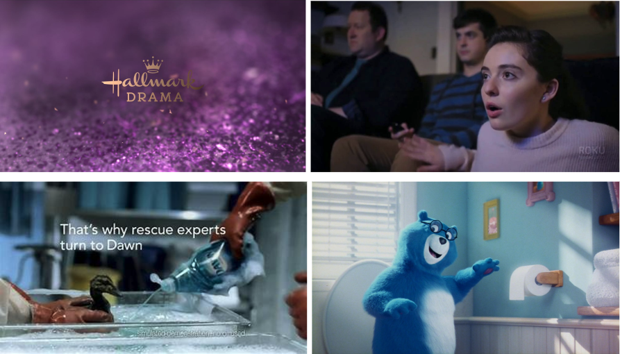
Then you’ve got purple, which, as we saw in Agatha’s world, is a color of mystery and power. Hallmark uses purple for luxury and sentimentality, while Roku’s purple is all about creativity and standing out in a sea of entertainment options.
And don’t get us started on blue – that trust-building, reliable color. It’s the color of calm and security, and it’s used by brands like Charmin (to make you feel comfortable, even about bathroom trips) and Dawn (to make you feel like they’ll always be there to care for your dishes – and your conscience).
Of course, you can’t forget us – your friendly creative, marketing and advertising agency, BKN Creative. Our use of black and yellow blends creative energy with sophistication, embodying everything we do. These colors reflect balance, helping us stand out while also maintaining our uniqueness. Like in cinema, we use our color palette to tell a story, using our radical authenticity to drive impactful design. By thoughtfully selecting colors aligned with your brand and incorporating color psychology, you will leave lasting emotional impressions and reinforce your identity.


Color Is Power, Baby
So, whether you’re behind the camera or behind a brand, color is the unsung hero of storytelling. It’s not just about looking pretty (though, let’s face it, color does look damn good). It’s about setting a tone, building emotional depth, and creating a connection that words just can’t. So the next time you’re thinking about what colors to use in your design, your brand, or your film, remember: color is your silent, powerful ally – your visual language that speaks louder than any words ever could.
And if all else fails, just remember: a bold splash of red, a dash of purple, and maybe a little bit of that good ol’ gold can make anything pop. You’re welcome!
Interested in learning how we use color to tell a story? Contact us!


